Trade shows are the perfect place to gain brand recognition. Here, you’ll introduce your product or service to the professionals in your business and a concentrated audience of interested individuals. Needless to say, making an impression is essential.
Check out some of our favorite ideas for trade show booths - from small budget to big installations!
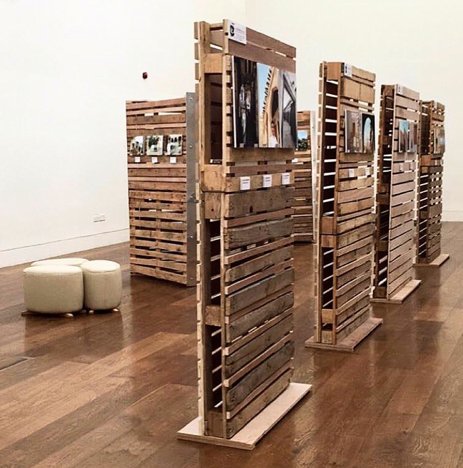
PALLETS are a favorite DIY option because they can be so diverse, from furniture to event entertainment, they are now making their way into exhibitions as a unique, rustic way of displaying products, signage or artwork.
This exhibition “booth” provides visitors with a more relaxed feeling. There’s an almost organic notion to the pallet walls. They can also be moved to accommodate larger crowds. The minimalist seating area makes it feel more welcoming to encourage guests to stay, yet doesn’t detract from the exhibit itself.
INDOOR PERGOLA
The concept of “outside in” is a treat for attendees after being “cooped-up” all day indoors. This small booth cleverly uses a garden pergola, not an expensive frame as. Other ways to bring the outdoors in is through live walls, garden furniture or games and grass mats or carpet (also shown here.)
Why we love it: Apple Wine ties in the bridal theme (as Pergolas can be a popular backdrop and stage for ceremonies) as well as creating an organic feel among what was likely a lot of non-romantic booths.
Pro tip: Create a selfie backdrop.
CARDBOARD BOOTH
Why cardboard? It travels light. It’s easy to assemble and it’s recyclable. It’s also a lot more durable than most people are aware. While this example shows a high-end application, you can use it for booth elements, logos, your entire booth, or even lounges.
THE ZEN SPACE
Trade show booths can feel sterile and uninviting. This booth ends that misperception.
Go Zen: the booth incorporates an airy, soothing atmosphere by bringing the outdoors in. It uses water elements and textures as interest with a minimal approach.
Put the audience at ease: It provides a contrast alongside much busier (from a design perspective) booths. It’s an oasis for those feeling overstimulated by the noise and crowds.
Added extra: don’t ruin the soothing atmosphere with overly zealous salespeople. Let your guests enjoy the peace and use a sales team that will help them achieve that.
INTERACTION
Encourage attendee participation with installations that make them stop, think and interact. You could incorporate giveaway codes or hidden prizes or merely make a fun activity to keep them entertained.
Why it stands out: the active component entices people to participate and think about your installation. Creating an active experience makes your booth one they’ll talk about.
Pro tip: add a leaderboard for healthy competition. Provide a prize for the overall winner of the day to create follow up opportunities with attendees and keep them coming back to check on where they stand.
THE JELLYFISH
There are few things that evoke the dreamy quality and natural beauty of the jellyfish but these displays encapsulate it beautifully.
These jellyfish-inspired pavilions are ideal for: showcasing products when you still want them partially shrouded in mystery.
Use this idea: for a dreamlike experience or unveil. Play up its luminescent quality with lighting.
THE FLOW
An excellent way to draw attendees in along a journey and create a visual experience is to use something with a visual flow. This curved design at the San Francisco Wildcards Exhibition accompanying the ACADIA conference does just that.
The theory behind the layout: With plenty of space to play with the different elements of this curved display, it can showcase new ideas and feed one into another. The semi-circle can be used for grouping ideas, concepts, time periods, or other items. The different areas naturally lend themselves to different atmospheres while remaining part of a cohesive installation. The unique shape moves people along.
Especially effective: in taking the viewer on a journey or progression as there’s a natural flow to the exhibit.
INTERACTIVE FLOORING
Remember the piano mat in the movie Big? It’s been replicated many times at trade shows and for good reason. People can’t help but play with it.
Why interactive flooring: it takes a dull idea, something we walk on and creates an opportunity to interact. Plus, with more and more people staring down at phones, an interactive floor can still get their attention while they text.
Use: as many senses as possible with lighting, sound, vibration, etc.
THE VENDING MACHINE
Rent or design a vending machine that spills out everything from product samples to trade show horoscopes.
Why we love them: Vending machines can be used for social media engagement or survey collection, answer a question, get a prize. Plus, there’s something about the anticipation of what you’ll get that is almost as great as the prize.
Be sure to: film a few of the prizes, especially if you have some funny ones in there or offer people a chance to “make a deal” based on what they received from the machine and what’s behind curtain number one.
IDEAL SETTINGS
Rent or design a vending machine that spills out everything from product samples to trade show horoscopes.
Why we love them: Vending machines can be used for social media engagement or survey collection, answer a question, get a prize. Plus, there’s something about the anticipation of what you’ll get that is almost as great as the prize.
Be sure to: film a few of the prizes, especially if you have some funny ones in there or offer people a chance to “make a deal” based on what they received from the machine and what’s behind curtain number one.


